


Why Most Homes Feel Random Instead of Intentional
May 29, 2026
You walk into some homes and everything just makes sense. The colors work together. The furniture fits the space. Each room flows naturally into the next. Then you walk into others—maybe even your own—and something feels off, even if you can't quite explain why.
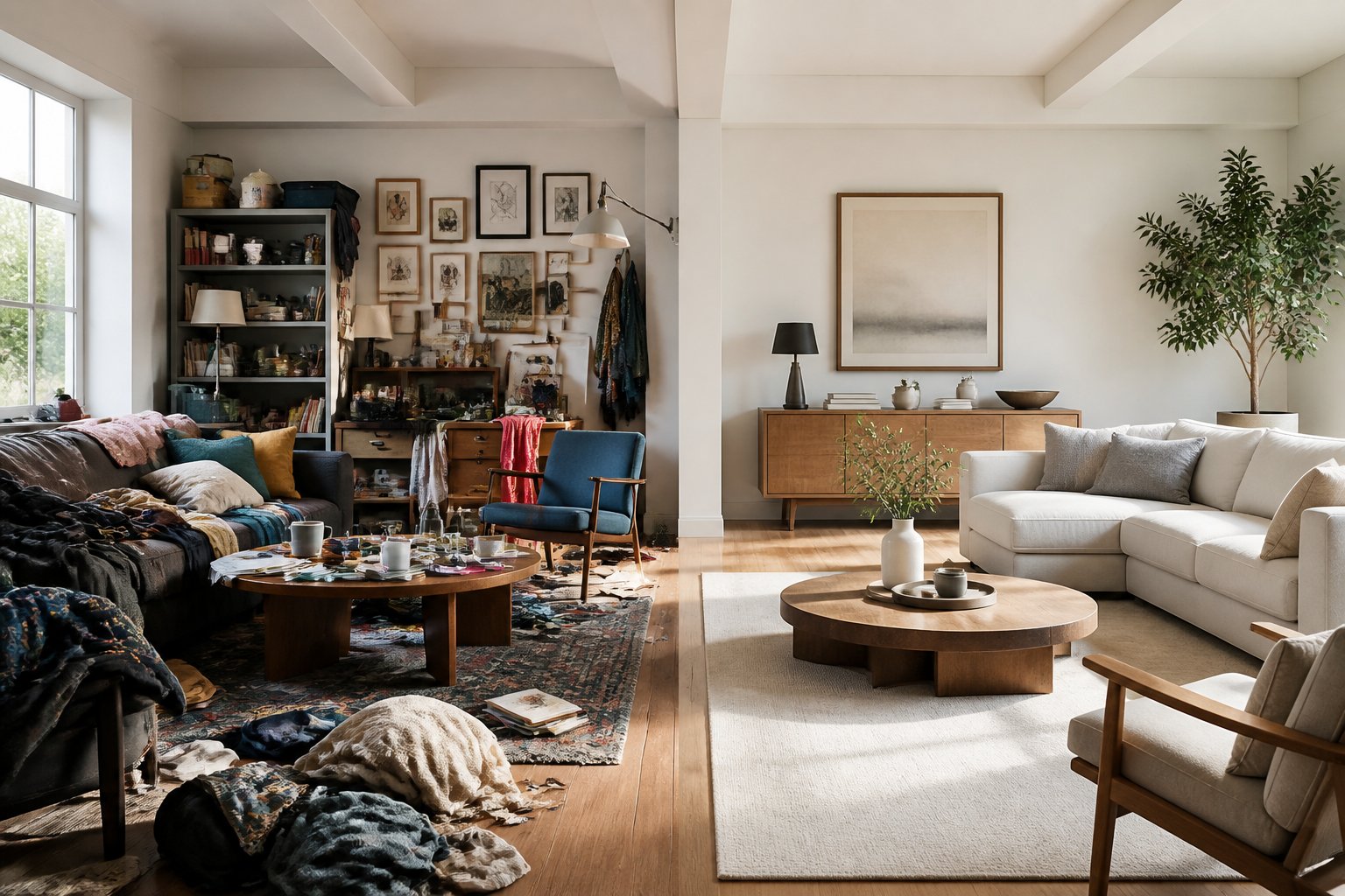
Most homes feel random because decisions are made one piece at a time without a larger plan connecting them together. A couch gets bought because it was on sale. A paint color gets chosen because it looked nice in the store. Decor gets added over time without thinking about how it all relates. The result is a collection of individual choices that never add up to a cohesive whole.
The difference between a home that feels intentional and one that feels thrown together comes down to a few key principles. When you understand what disrupts visual flow and what creates it, you can start making choices that actually work together instead of against each other.
Common Design Mistakes That Disrupt Flow
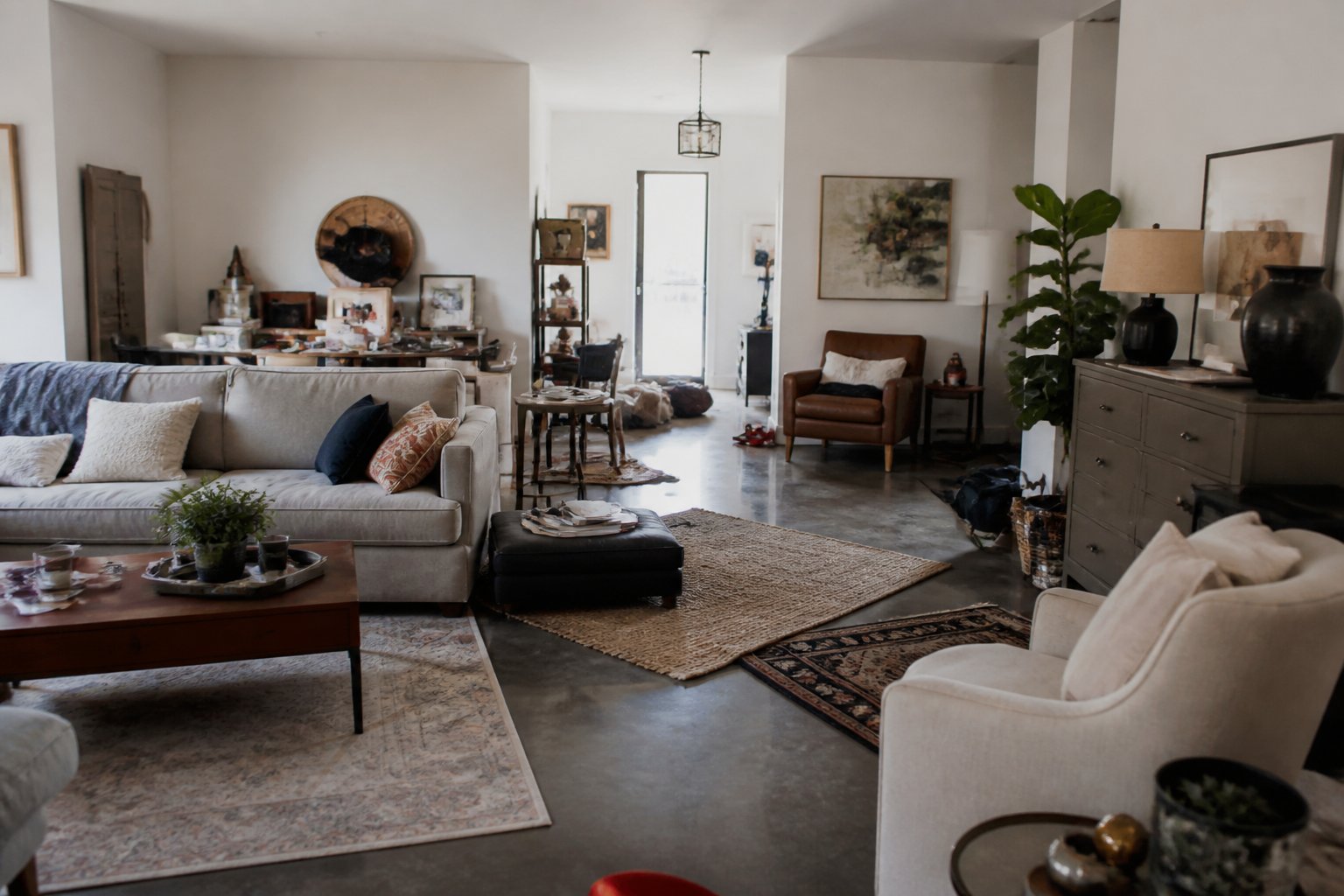
When homes lack intentional design, the problem usually shows up in three ways: colors that compete instead of complement, furniture that blocks natural movement, and mixed styles that create visual confusion.
Lack of Cohesive Color Schemes
Your color choices either tie rooms together or make them feel disconnected. When you paint each room a completely different color without any connecting thread, your home feels choppy as you move from space to space.
The issue gets worse when you ignore undertones. A warm beige in one room clashes with a cool gray in the next, even though both seem neutral. Your eyes pick up on this mismatch immediately.
Common color scheme mistakes include:
- Using too many accent colors throughout the home
- Failing to repeat key colors in adjacent spaces
- Ignoring natural light when selecting paint
- Choosing colors in isolation without considering what you can see from doorways
You need a consistent color story. Pick three to five colors total for your main living spaces. Use them in different proportions from room to room, but keep them present so your eye finds familiar elements as you move through your home.
Mixing Clashing Styles and Periods
Combining different design styles can work, but only when done with clear intention. Most homes feel random because they mix farmhouse, modern, traditional, and industrial elements with no unifying thread.
The problem isn't variety itself. It's throwing together pieces that share nothing in common. A sleek glass coffee table, a rustic wooden bench, an ornate Victorian mirror, and industrial metal shelves in the same room create visual chaos.
Your spaces need something to connect different pieces. This could be similar wood tones, repeated metal finishes, or consistent lines and shapes. Without these connecting elements, every item competes for attention.
Limit yourself to two main styles maximum. Let one be dominant and use the other as an accent. This gives you variety without confusion.
Improper Furniture Placement
Furniture that blocks doorways or cuts through natural walking paths makes your home feel cramped and awkward. You should be able to move from one area to another without squeezing between pieces or taking an indirect route.
The biggest mistake is pushing all furniture against walls. This creates dead space in room centers and makes conversation areas feel disconnected. Float your sofa away from the wall to define zones and improve flow.
Another common error is choosing furniture that's too large for the space. An oversized sectional might seem comfortable, but if it leaves only narrow passages around it, your room feels crowded. Leave at least 30 inches for main walkways and 18 inches for secondary paths.
Position furniture to guide movement, not obstruct it. Your largest pieces should define activity zones while keeping clear paths between entry points.
Strategies for Creating a Unified Home Environment
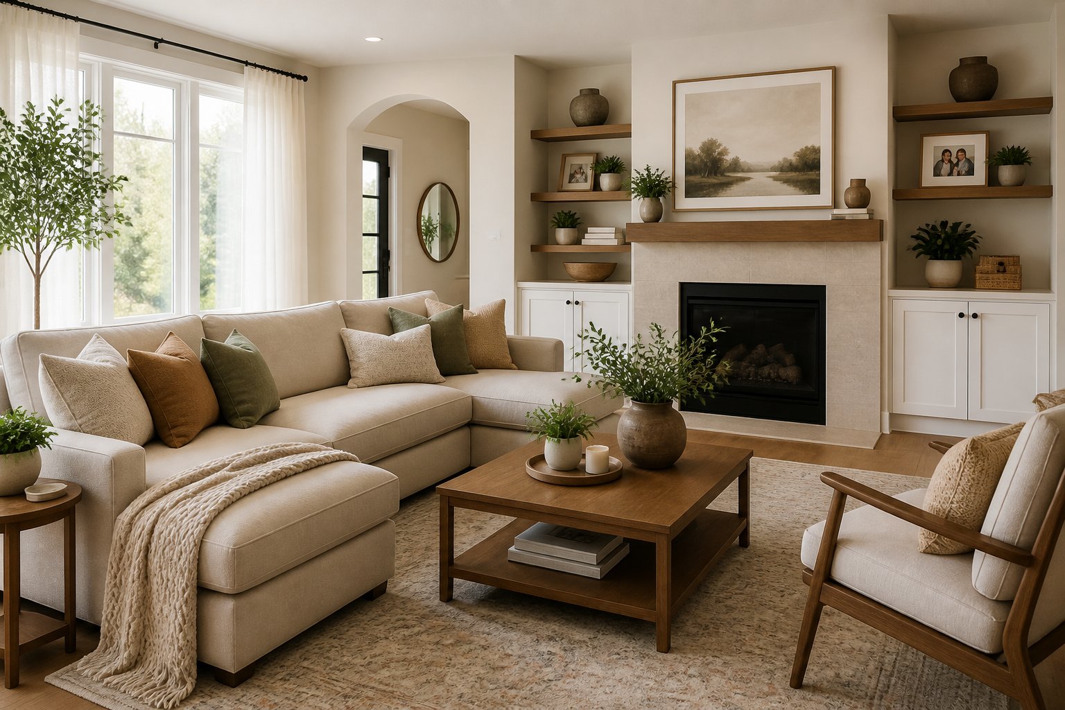
A unified home requires two fundamental approaches: creating visual patterns that connect your spaces and making design choices that reflect what matters to you.
Establishing Visual Consistency
Visual consistency comes from repeating specific design elements across multiple rooms. This doesn't mean everything needs to match perfectly.
Start with a limited color palette of three to five colors. Use these same colors in different rooms through paint, furniture, and accessories. For example, if you choose navy blue, cream, and warm wood tones, these should appear throughout your home in varying amounts.
Key elements to repeat include:
- Metal finishes (brass, chrome, or black)
- Wood tones (light oak, walnut, or painted finishes)
- Design style details (modern lines, traditional curves, or rustic textures)
- Pattern scale (small florals, large geometric, or no pattern)
Pick one or two materials to use as a thread through your space. If you use marble in your kitchen, incorporate it in a bathroom or entryway. If you choose velvet for living room pillows, add a velvet chair in your bedroom.
The goal is recognition without repetition. When you walk from room to room, your eye should catch familiar colors or materials without seeing the exact same items.
Incorporating Personal Values into Design
Your design choices should reflect how you actually live and what you care about. This creates spaces that feel authentic rather than staged.
If family time matters most, arrange furniture to encourage conversation rather than focusing everything toward a television. If you value reading, place comfortable chairs near windows with good lighting and keep books visible.
Make practical choices that match your lifestyle. A household with young children needs durable fabrics and washable surfaces. A person who cooks daily needs an organized kitchen with easy-to-reach tools.
Design around your priorities:
- Active lifestyle: durable flooring, minimal breakables
- Entertainer: open layouts, extra seating
- Collector: display shelving, adequate storage
- Minimalist: hidden storage, simple color schemes
Select furniture and accessories that serve a purpose you actually need. Empty decorative bowls and unused accent chairs make spaces feel generic. Items you use daily create authentic, lived-in environments that still look intentional.
Frequently Asked Questions
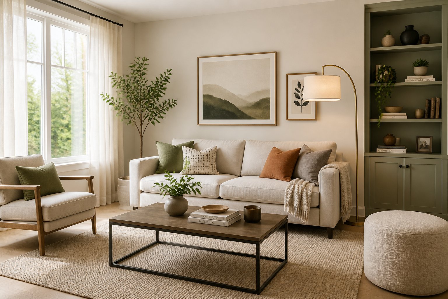
Many homes feel disconnected because of uncoordinated color schemes, furniture in conflicting styles, and a lack of intentional planning from room to room. These issues stem from impulse purchases and missing visual anchors that tie spaces together.
What are the most common reasons a home looks visually inconsistent from room to room?
The most common reason is buying furniture and decor without a unified color scheme. When you purchase items based on individual appeal rather than how they work together, rooms end up feeling disconnected.
Different flooring materials in adjacent rooms also creates visual breaks that disrupt flow. Hardwood in one room, carpet in another, and tile in a third makes your home feel choppy and unplanned.
Mixing too many design styles creates confusion. If your living room is modern, your bedroom is farmhouse, and your kitchen is traditional, your home lacks a coherent identity that connects the spaces.
Inconsistent lighting types across rooms makes the problem worse. Warm lighting in one space and cool lighting in another changes how colors appear and prevents smooth transitions between areas.
How can I create a cohesive design style when I like multiple aesthetics?
Pick one dominant style and use it for 70% of your design choices. This creates your home's foundation and prevents the space from feeling scattered.
Pull accent elements from your secondary style for the remaining 30%. This allows you to incorporate other aesthetics you love without overwhelming the main design direction.
Find common elements that appear in both styles you like. Natural wood appears in farmhouse and mid-century modern styles, so using it throughout creates continuity even when mixing aesthetics.
Stick to a limited color palette that works for both styles. Colors act as the glue that holds different design elements together and makes combinations feel intentional rather than accidental.
What is the 2/3 rule for a living room, and how do I apply it correctly?
The 2/3 rule states that your area rug should cover about two-thirds of your floor space. This grounds your furniture and defines the seating area without making the room feel cramped.
The rule also applies to furniture placement on the rug. The front two-thirds of your sofa and chairs should sit on the rug, with back legs either on or off depending on the room size.
For wall art, the 2/3 rule means your artwork should take up roughly two-thirds of the wall space above furniture. A piece that's too small looks lost, while one that's too large overwhelms the space.
This proportion creates visual balance that feels natural to the eye. Rooms that follow this guideline appear more polished and intentional than those with extreme size relationships.
Which decorating mistakes make a space feel cluttered or accidental rather than curated?
Displaying too many small decorative items creates visual noise. When every surface holds multiple objects, your eye has nowhere to rest and the space feels chaotic.
Furniture pushed against walls makes rooms feel stiff and unintentional. Floating furniture away from walls creates conversation areas and makes the layout feel purposeful.
Mismatched furniture scales make spaces look accidental. A tiny coffee table with an oversized sectional, or a large dining table with small chairs, signals a lack of planning.
Exposed cords and cables immediately make a space look unfinished. These practical necessities break the visual flow and remind you that the space wasn't thoughtfully organized.
Too many competing focal points confuse the eye. When multiple bold elements fight for attention, nothing stands out and the room feels disorganized.
How do I choose a consistent color palette that works across the entire home?
Start with three colors: one neutral base, one main color, and one accent. This simple framework prevents color overload while providing enough variety to keep spaces interesting.
Your neutral should appear in 60% of each room through walls, large furniture, or flooring. This creates the backdrop that allows your other colors to shine without overwhelming the space.
Use your main color in 30% of the room through medium-sized furniture, curtains, or rugs. This color should appear in every room to create the thread that connects your spaces.
Reserve your accent color for 10% of each room in pillows, artwork, or small decor items. This pop of color adds energy without dominating the space.
Test your colors in different lighting conditions before committing. Colors change dramatically between morning and evening light, so viewing them at various times ensures they work throughout the day.
What are the least desirable house styles for resale value, and why do buyers avoid them?
Mediterranean-style homes with heavy stucco, arches, and tile roofs perform poorly in many markets. Buyers find them dated and expensive to update since the architectural features are difficult to modify.
Split-level homes from the 1960s and 1970s struggle with resale. The choppy layout with multiple short staircases feels awkward to modern buyers who prefer open floor plans.
Highly customized or quirky homes with unusual layouts limit your buyer pool. Most people can't envision living in a home with a very specific or eccentric design.
Homes with popcorn ceilings, outdated wallpaper, or heavy wood paneling signal deferred maintenance. Buyers see these features as immediate projects that require time and money to fix.
Colonial-style homes in regions where they're uncommon face challenges. A New England colonial in Arizona feels out of place and doesn't match what local buyers expect or want.