


The Home That Looks Effortless in Every Photo
June 10, 2026
You have probably seen homes on social media that look perfect in every photo. They seem natural and calm, and every angle looks good. Making a home that looks effortless in photos begins with simple design choices that work in real life too.
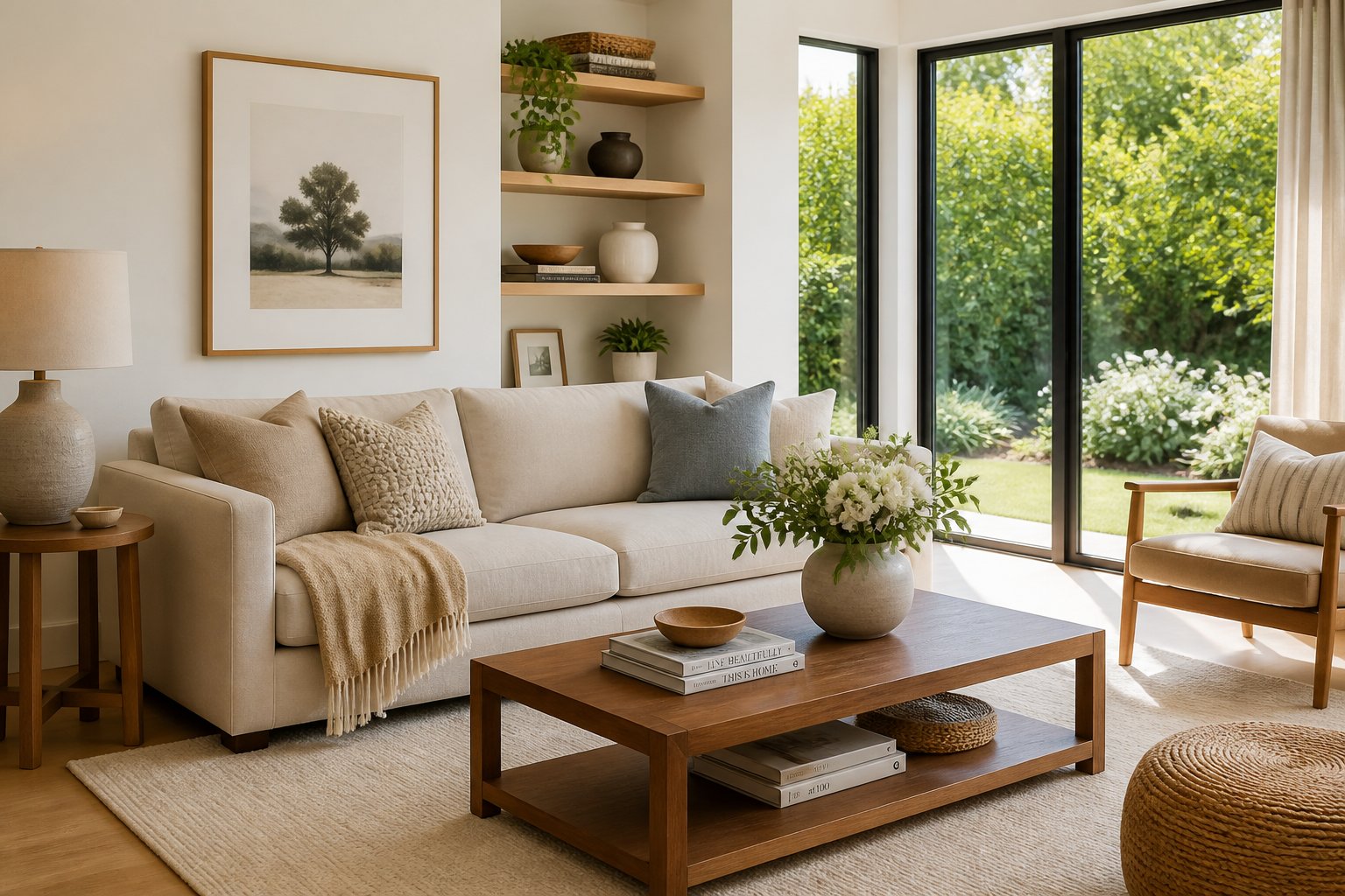
The secret is knowing how a camera sees your space. Think about light, keeping things tidy, and small styling tricks. You do not need fancy furniture or a full makeover to make rooms look great in photos.
This guide explains the main ideas behind photogenic rooms and gives simple tips you can use at home. You will learn how to make spaces that look good in pictures and are still comfy and useful every day.
Core Principles of an Effortlessly Photogenic Home
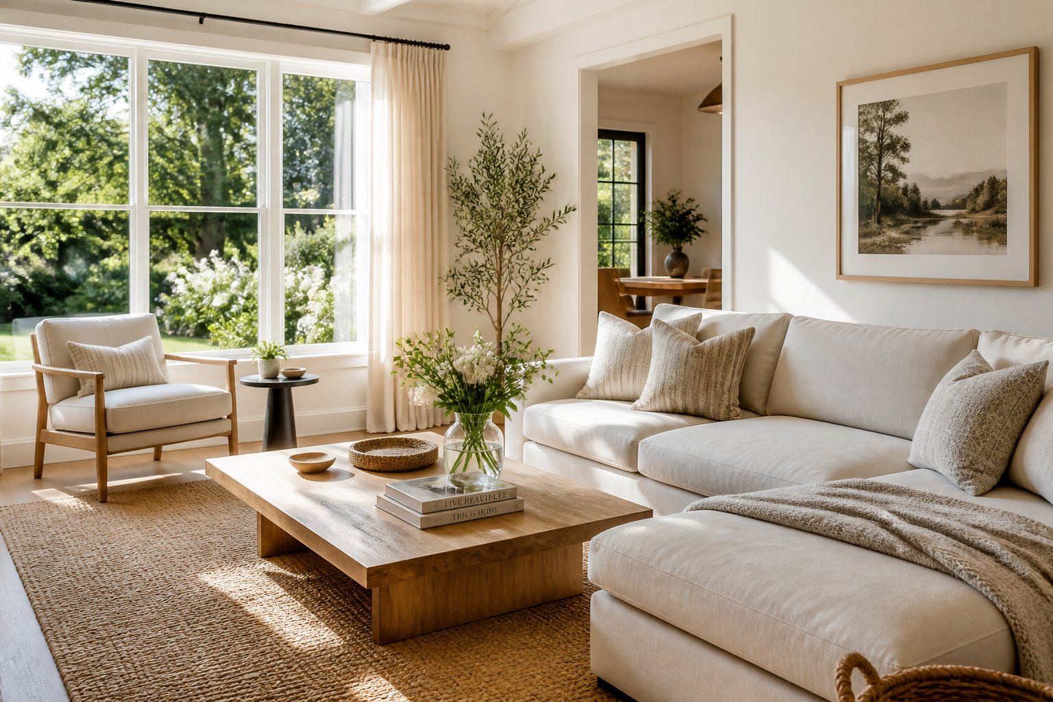
Most camera-ready homes share three main traits: strong basic design, colors that match, and good use of light. These things help rooms look great from any angle without feeling fake or overdone.
Foundational Design Choices
Your home needs simple design basics before you worry about decor. Choose furniture that fits the room and place pieces so people can move around easily.
Pick a main focus for each room. It can be a fireplace, a big window, or a standout piece of furniture. Arrange other items around that spot to make the room feel balanced.
Size is important. Too-big furniture makes a small room feel crowded in photos. Too-small furniture in a large room looks lost. Measure your rooms and leave space between pieces.
Key basic elements include:
- Furniture that looks good and works well
- Clear paths so people can walk easily
- A clear purpose for each room
- Furniture that matches the room size
Mix textures like wood, metal, fabric, and stone to add interest without clutter. Different materials show up differently in photos.
Consistent Color Palettes
A simple color scheme helps every photo look put-together. Choose three to five colors to use through your home.
Use one main neutral, one or two supporting colors, and one accent color. Neutrals like white, beige, or gray should cover most of the space. Supporting colors appear on things like curtains and rugs. Accent colors show up on pillows, art, or small accessories.
Repeat colors from room to room to make the home feel connected. They do not have to be exact matches—similar shades work well.
Don’t use too many different colors. Stick to your palette, even when you add seasonal items or new decor.
Strategic Placement of Natural Light
Natural light makes rooms look warm and more attractive in photos. Arrange furniture so windows are not blocked.
Put mirrors across from or next to windows to reflect light and make rooms brighter. This also adds depth in photos.
Choose light, simple window coverings like sheer curtains or light blinds. Open curtains fully during the day to let in more light.
Think about how light moves through the room at different times. Place seating and work areas where they get good daylight. North-facing windows give even light; south-facing windows give brighter, warmer light.
Remove items that cast heavy shadows or block light. Place tall furniture on walls next to windows, not directly in front of them.
Styling Techniques That Look Great in Photos
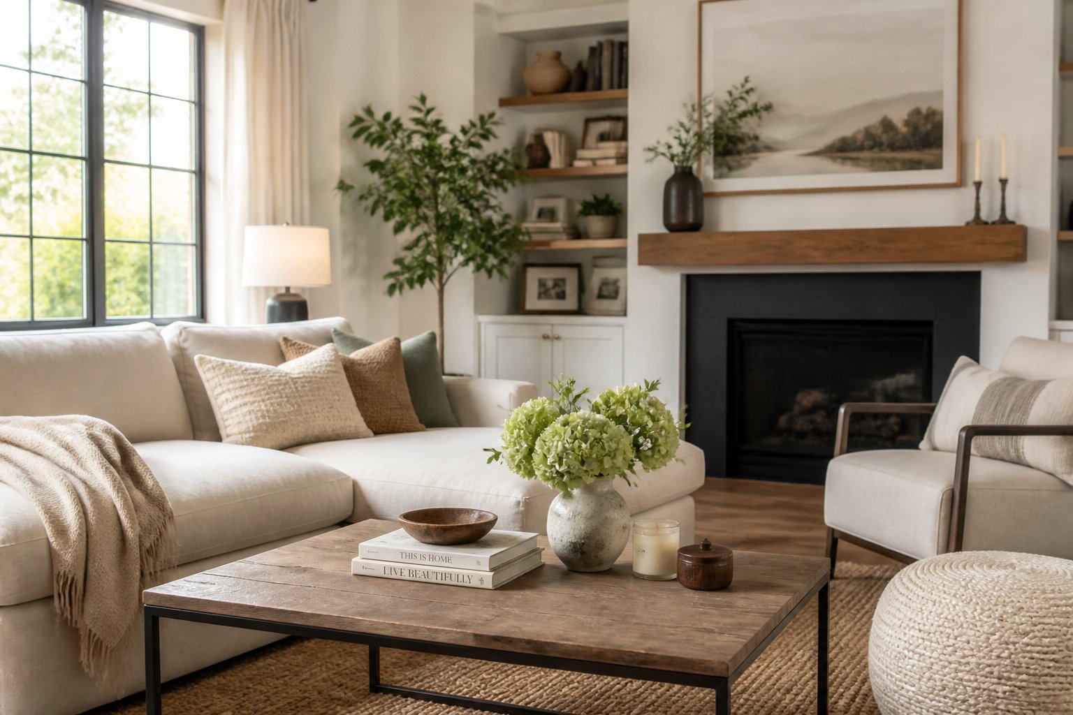
Cameras see things differently than our eyes. Some styling choices show up better in photos. The right textures, a few chosen accents, and small edits help a room look natural and polished in pictures.
Layer Textures for More Depth
Texture makes photos look deeper and more interesting. Use a few different materials in each room so the camera can pick them up.
Aim for three to five different textures. Mix smooth items like glass or metal with rough things like woven baskets or linen. Add wood tones from furniture. Use soft items like throw blankets, pillows, or rugs.
Texture pairs that work well in photos:
- Leather with a chunky knit throw
- Shiny ceramic vases with matte wood
- Velvet pillows on linen furniture
- Wicker baskets next to metal fixtures
Notice how light hits textures. Matte surfaces soak up light and glossy ones reflect it. That contrast helps the camera see different objects and adds depth.
Choose Decorative Accents Carefully
The right little items make a room feel planned but not messy. Keep only pieces that help the photo.
Group things in odd numbers, like three or five. Odd numbers look natural. Use objects of different heights in each group to make it more interesting.
Pick accents that have a purpose. Books add color and height. Plants add life and texture. Trays and bowls hold small items and add another layer. Keep colors that match the room.
Take away items with busy patterns or loud logos. Your decor should help the room, not distract from it.
Keep Spaces Clutter-Free
Clear surfaces look better in photos than crowded ones. Remove most items from counters, tables, and shelves before you shoot.
Only leave a few essential or decorative pieces. In kitchens, keep counters mostly clear except for one or two styled items. On coffee tables, leave a small stack of books or a single decorative object.
Hide everyday things like remotes, chargers, and mail. Put away personal photos and toiletries. Close closet doors and cabinet fronts so lines look clean.
The goal is not to make the space look unused but to remove distractions. Every item left in the frame should have a reason to be there.
Frequently Asked Questions
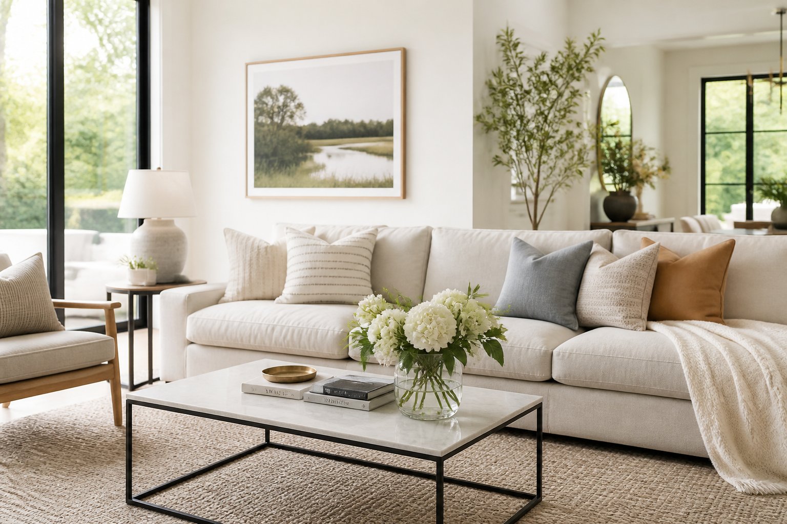
Making your home camera-ready involves understanding how colors work together, how light interacts with surfaces, and how to arrange items so they look natural instead of forced.
What design principles make interiors look polished and camera-ready without feeling staged?
Start with a cohesive color palette that flows from room to room. When you use too many different colors in each space, your home looks disjointed in photos.
Layer different textures to add visual interest without clutter. Mix smooth surfaces with rough ones, like pairing linen pillows with a leather chair or placing a wool throw on a velvet sofa.
Keep surfaces mostly clear but not completely empty. Leave out only items that serve a purpose or hold meaning to you. A stack of books, a single vase, or a small tray with everyday items looks more natural than bare counters or crowded shelves.
Which color palettes consistently make a home look more expensive in photos?
Neutral tones create the most polished look in photographs. Stick with warm white, beige, taupe, greige, and soft gray as your base colors.
These shades photograph well because they create visual harmony instead of competing for attention. They also make spaces look larger and brighter on camera.
You can add depth by using different shades of the same color family. Try pairing cream walls with tan furniture and darker brown accents. This approach feels intentional without looking too coordinated.
How can I style a kitchen to achieve a bright, timeless, movie-inspired look?
Clear your countertops of most items before taking photos. Leave out only a few carefully chosen pieces like a wooden cutting board, a ceramic bowl, or a potted herb plant.
Use white or light-colored dishes and accessories to reflect light. Dark items absorb light and can create shadows that make your kitchen look smaller in photos.
Keep your dish towels, pot holders, and other fabric items in neutral colors that match your overall palette. Replace brightly colored plastic items with wood, glass, or ceramic alternatives that photograph better.
What are the most effective lighting strategies for flattering indoor photos at any time of day?
Natural light creates the most flattering photos. Open your curtains and blinds during the day to let in as much daylight as possible.
Take photos during the golden hours right after sunrise or before sunset when light is softer. Harsh midday sun can create strong shadows that look unflattering.
Turn on all your lights when natural light is limited. Mix overhead lights with lamps to eliminate dark corners and create even lighting throughout the room.
Avoid using just one light source, which creates harsh shadows. Layer multiple light sources at different heights to make the space look warm and inviting.
How should I arrange furniture and decor to create balanced, photogenic compositions in each room?
Place furniture away from walls to create depth in photos. Even pulling pieces out just a few inches makes a room look more intentional and spacious.
Group decor items in odd numbers like threes or fives. This creates visual interest that feels natural instead of too symmetrical.
Vary the heights of items you display together. If you group three vases, make sure they are different sizes so your eye moves around the arrangement.
Leave open space between furniture pieces and decor items. Negative space helps each element stand out and prevents the room from looking cluttered in photos.
Which materials, textures, and finishes photograph best for an elevated, effortless aesthetic?
Natural materials like wood, linen, cotton, and stone photograph better than synthetic alternatives. They add warmth and texture that translates well on camera.
Matte finishes work better than high-gloss surfaces for most spaces. Shiny materials can create glare and reflections that distract from the overall composition.
Metal finishes like brushed brass, aged bronze, or matte black add visual interest without overwhelming a space. Choose one or two metal finishes and use them consistently throughout your home.
Textured fabrics like bouclé, chunky knits, and natural weaves add dimension that shows up well in photos. These materials catch light in interesting ways that make images more dynamic.