


1950s Paint Color Trend Taking Over: Nostalgic Color Palette
July 25, 2025
In 2025, one color is charming designers, decorators, and homeowners alike: butter yellow. Soft, cozy, and cheerfully vintage, this 1950s paint color trend is making a major comeback. It’s popping up on walls, cabinets, and home accessories as the nostalgic hue of the moment—offering a warm, feel-good alternative to stark neutrals or loud brights.
Butter yellow’s revival feels both retro and modern, offering a fresh way to add comfort and charm to your home.

Why Butter Yellow Feels Nostalgic and Fresh
Butter yellow instantly evokes memories of sun-soaked kitchens, warm toast, and cheerful retro diners. Its pastel tone recalls the softness of the 1950s color palette, when optimism filled homes and kitchens were cozy gathering spots.
This mellow hue creates a comforting atmosphere, which explains its comeback in today's fast-paced world. Designers love how butter yellow balances serenity and energy. It’s soft enough to act as a neutral, yet rich enough to stand out—bringing timeless charm and positivity to any room.

Butter Yellow Across Trends and Brands
In 2025, butter yellow isn't just a quiet trend—it’s front and center in the design world:
- KitchenAid named “Butter” its Color of the Year, turning its popular stand mixers into nostalgic centerpieces.
- Sherwin-Williams featured “Icy Lemonade” as its June Color of the Month, a pastel yellow that's gentle and versatile.
- On runways and in art licensing, butter yellow is part of the “foodification of color” trend, where soft, edible tones (think cream, peach, pistachio) lead the way in fashion and interiors.
Together, these appearances show butter yellow isn’t just about nostalgia—it’s about embracing warmth and playfulness in today’s homes.

How to Use Butter Yellow in Your Home
Butter yellow is surprisingly versatile. Whether you're repainting a full room or adding just a touch, here are some great ways to use it:
Paint and Walls
Butter yellow makes an excellent wall color, especially in:
- Kitchens, for that sunny, retro vibe.
- Guest bedrooms, to welcome visitors with warmth.
- Powder rooms, where bold choices shine in small spaces.
- Sunrooms, enhancing natural light with a golden glow.

Cabinetry and Doors
For a unique spin, paint your kitchen cabinets or interior doors in butter yellow. It adds character while still feeling clean and soft. This color pairs beautifully with wood tones, brass, and rattan for a laid-back, earthy effect.

Textiles, Decor & Functional Accessories
Not ready to commit to paint? Butter yellow shines in:
- Curtains or striped window treatments.
- Throw pillows and blankets on neutral sofas.
- Appliances like toasters, blenders, and yes—KitchenAid mixers

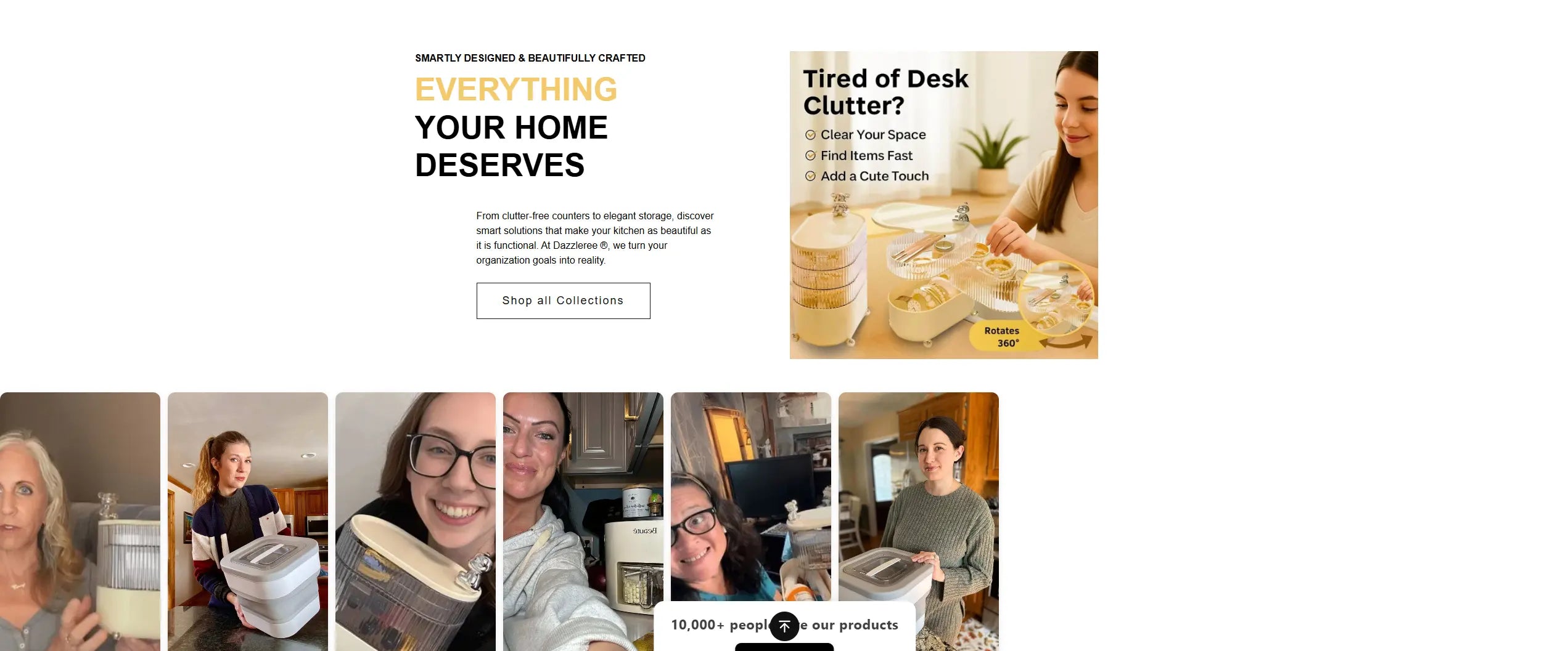
Bonus Tip: Add a touch of nostalgic charm and modern functionality with our rotating 3-tier desk organizer. Its butter-toned finish and space-saving design fit seamlessly into mid-century inspired interiors—perfect for organizing hair accessories, jewelry, cords, or daily essentials. Stylish, compact, and cheerful—this organizer brings both form and function to any countertop or vanity.

Best Color Pairings with Butter Yellow
What makes butter yellow especially appealing is how well it works with other popular tones:
- Natural woods and neutrals: Pair it with oak, cane, or beige for a cozy, mid-century look.
- Blues and greens: From sage to teal, these hues offer a peaceful, nature-inspired contrast.
- Plums, pinks, and earthy reds: Add depth and playfulness to bedrooms or living rooms.
By mixing butter yellow with these complementary colors, you can create a balanced palette that feels both nostalgic and modern.

Key 2025 Rooms to Paint Butter Yellow
Looking for a place to try this trend? These rooms are top picks:
- Kitchen: The heart of the home, butter yellow adds warmth and retro charm.
- Sunroom: Natural light brings out its golden tones, creating a cheerful, calming vibe.
- Powder Room: A small space with big impact—this is your chance to go bold and playful.
- Guest Bedroom: Create a welcoming, cozy feel that still feels light and airy.
Each of these rooms can benefit from butter yellow’s friendly and flexible nature.

Tips Before You Paint
Before going all in, here are a few smart steps:
- Test paint samples in natural light. Butter yellow may look more orange or green depending on your wall and light exposure.
- North-facing rooms may bring out cooler tones—so test in different parts of the room before deciding.
- Start small if you’re unsure. Try an accent wall, interior door, or furniture piece first.
This approach helps you avoid surprises and ensures your space feels right from the start.

Conclusion
Butter yellow is the nostalgic paint color trend that’s warming up homes across the globe in 2025. With its roots in 1950s design and its modern, optimistic feel, this soft pastel shade offers something special: comfort, charm, and timeless appeal.
Whether you’re painting a wall, updating your kitchen, or adding soft accents, butter yellow brings a gentle energy that feels just right. It’s cheerful but calm, vintage yet versatile. It proves that sometimes, the best trends are the ones we’ve loved all along.
So go ahead—bring a little butter yellow into your home and enjoy the sunny vibes every day.

Frequently Asked Questions
What is butter yellow paint?
Butter yellow is a soft, pastel shade of yellow inspired by 1950s design. It blends warmth and brightness, making it ideal for kitchens, bedrooms, and sunny spaces. In 2025, it's trending as a nostalgic yet modern neutral for interiors.
Why is butter yellow a trending paint color in 2025?
This cheerful color brings comfort and retro charm to homes. It evokes the mid-century aesthetic and pairs beautifully with today’s favorite materials—like natural woods, cane, and brass. Plus, its versatility makes it easy to use in any room.
Can butter yellow be used as a neutral paint color?
Yes! Despite its sunny tone, butter yellow works well as a neutral backdrop. It adds warmth without overwhelming a space and blends easily with beige, cream, greige, and natural materials.
What colors go well with butter yellow?
Butter yellow pairs beautifully with sage green, teal, navy blue, blush pink, plum, beige, and warm wood tones. These color combinations add balance and visual interest to any interior.
Where in my home should I try butter yellow paint?
Try it in the kitchen, guest bedroom, powder room, or sunroom. It’s especially popular in smaller spaces where you want a soft splash of color with a cozy, vintage vibe.
How do I add butter yellow without painting my walls?
Use butter yellow in your curtains, throw pillows, kitchen appliances, or small accessories—like our 3-tier rotating desk organizer that’s both functional and on-trend.
Is butter yellow a good color for small spaces?
Absolutely. Its light tone reflects natural light, making small spaces feel brighter and more open, while still adding personality and charm.